CASE STUDY
Building a brand from scratch that artists actually trusted
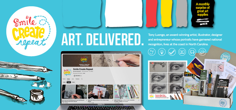
Seven years of full brand ownership for Smile Create Repeat — an art supply subscription box built on authentic creative credibility, not craft-store nostalgia.
| Client Smile Create Repeat |
Type Startup — built from zero |
Duration 7 years | Audience Women, children, gift-givers & creatives |
The brief
Smile Create Repeat needed more than a logo — they needed a world. As a brand-new subscription box in a space that skews either mass-market crafty or intimidatingly fine-art, the challenge was carving out something in between: playful and approachable, but with genuine artistic credibility behind it. The kind of brand that feels like it was made by someone who actually makes things.
What I brought to it
As an award-winning artist, I wasn’t just designing for a creative audience — I was part of it. That authenticity shaped every decision, from how the products were photographed to how the brand spoke. This wasn’t a designer guessing at what artists want. It was an artist building a brand for people like me.
Full scope of work
- Logo & brand identity: Built from the ground up, covering wordmark, color palette, typography and brand guidelines.
- Packaging design: The unboxing experience was part of the creative — every surface was considered.
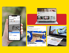
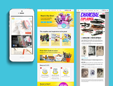
- Website: Full site and email design reflecting the brand every step through the funnel to checkout.
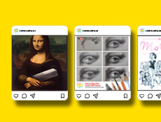
- Social media: An ongoing content system that kept the brand consistent and active across platforms.
- Advertising: Paid and organic campaigns designed to grow the subscriber base.
- Illustration: Original watercolor, pen and ink artwork ran throughout the brand, giving it handmade warmth no stock library could replicate.
- Video production: A monthly demonstration series showing subscribers exactly how to use their new supplies — one of the brand’s most distinctive assets.
- Print collateral: Inserts, guides, and printed collateral that completed the physical brand experience.
The creative direction
The visual language leaned heavily on the actual product. Rather than generic lifestyle photography, we let the art supplies do the talking — showing subscribers exactly what was in the box and what it could do. That honesty built trust.
Alongside product photography, original traditional illustrations in watercolour, pen and ink ran throughout the brand. The monthly demonstration video series became equally central — showing subscribers not just what they received, but how to use it. For an audience that ranged from curious beginners to serious hobbyists, that was the difference between a box that piled up and one that got opened immediately.
The result
- The brand sustained and grew continuously for seven years — a testament to a creative foundation built to last.
- Organically featured by The Art Sherpa, one of YouTube’s most-followed art creators, without a paid influencer arrangement.
- Built a loyal subscriber community spanning women, children, and gift-buyers — connecting with multiple audiences through a single, coherent brand voice.
“Getting featured by The Art Sherpa wasn’t a PR campaign — it was the brand doing its job. When your creative is authentic, the right people notice on their own.”